
Streetlane Homepage Redesign
Overview
Streetlane, a property management company acquired by Roofstock, required a homepage redesign to improve user engagement and accessibility. The core challenge was to redesign the navigation menu to enhance user-friendliness and ensure users could easily view properties, which was vital for the business goal of decreasing the bounce rate and highlighting new listings.
Problem: Redesign navigation for improved accessibility and property visibility.
Business Goal: Decrease bounce rate by improving usability and property discoverability.
Team: Senior Program Manager, Visual Designer, UX Researcher, Software Engineer
Duration: 2 Months
StreetLane's homepage redesign project faced a challenge with navigation usability. With a growing number of cities listed on the site, it became increasingly difficult for users to access the properties behind the menu, making them less visible. This posed a problem for the company as it needed to ensure users could easily view the properties, while also making the website more user-friendly. This challenge became even more pronounced as StreetLane continued to add new properties to its portfolio. The video below shows what the website looked like before the changes.
Problem
Partnering with the UX Researcher, I helped define the primary users (real estate investors, property owners, and tenants) and synthesized crucial insights:
Users found the previous navigation confusing and cluttered.
They desired a more visual and direct way to explore available properties (moving beyond text-based menus).
Users expressed frustration with slow website loading times. These data-driven insights were critical, directly informing the design strategy and guiding the creation of a more intuitive navigation menu to address core user pain points.
Research
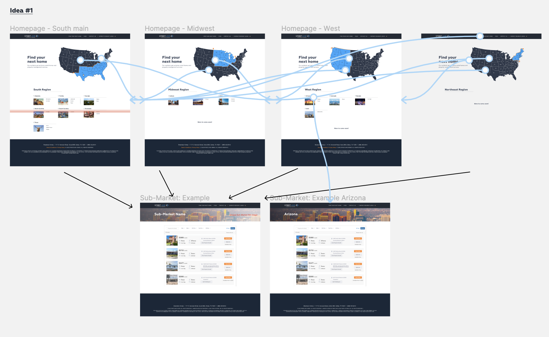
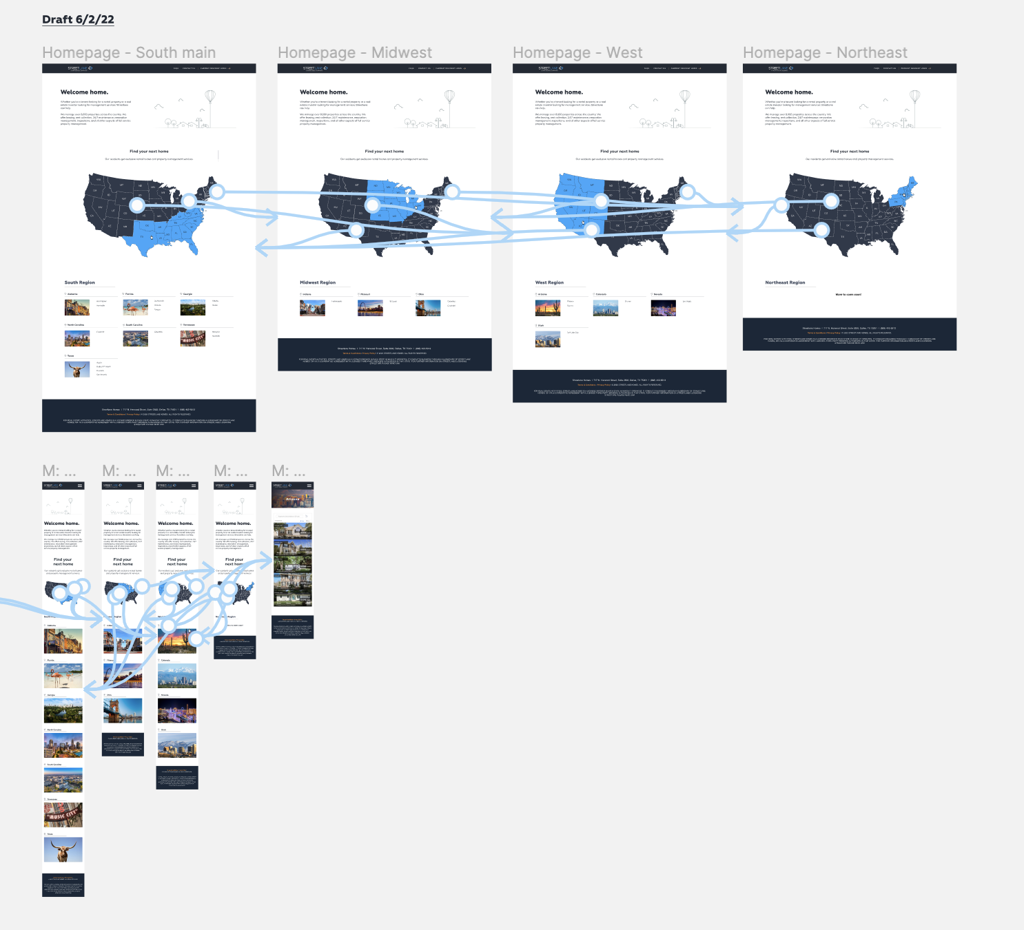
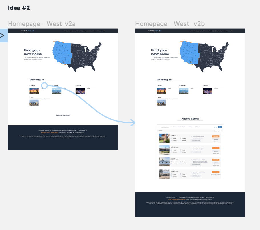
As the Visual Designer, I developed and presented three distinct conceptual solutions based on design heuristics prioritizing visibility, flexibility, and simplicity. The final selected approach involved organizing properties by individual state. This strategy was chosen because it strongly aligned with observed user preferences and provided a scalable, familiar navigation path for future property additions.
Iterations
The final solution successfully addressed the product challenge by focusing on three key design heuristics:
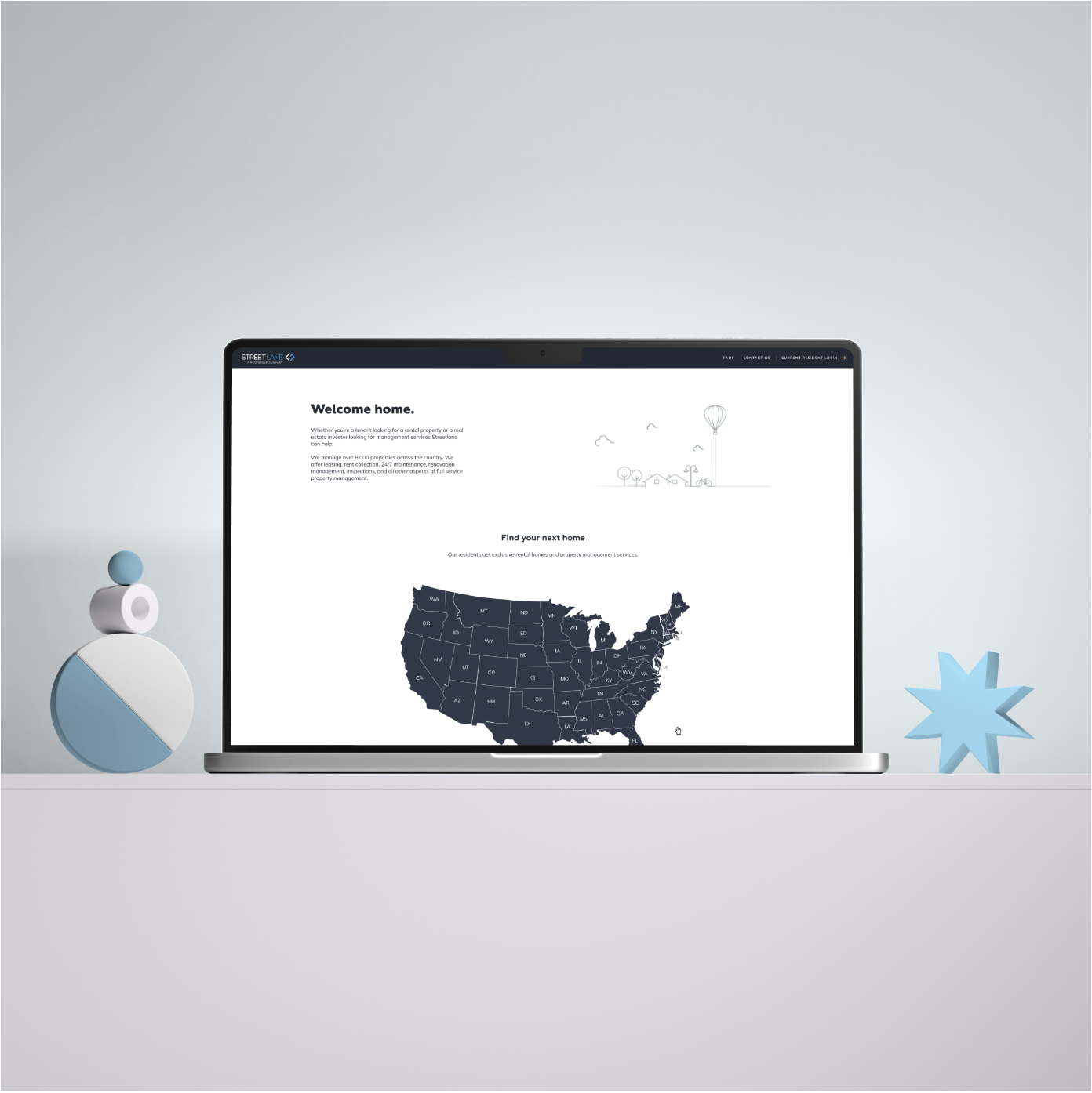
Visibility: Implemented an interactive map to provide users with a better visual representation of available properties on the homepage.
Flexibility: Allowed users to explore properties in a personalized way (zoom, filter, etc.), supporting diverse use cases.
Simplicity: Resulted in a less cluttered homepage with clear, intuitive navigation categories, which directly improved the key metric of decreasing the bounce rate.
Solution
Prototype
In summary, the redesign of Streetlane's homepage navigation was successful. The team focused on three key aspects: visibility, flexibility, and simplicity. By improving these areas, the team was able to create a better user experience. This project highlighted the importance of continuously improving website design. User needs and preferences change over time, and it is important to remain attentive to them. By doing so, Streetlane and Roofstock can continue to provide a customer-centric real estate investing experience.
If I had more time, I would run more user tests. Although the project was successful, there is always room for improvement. By conducting additional tests with clients, the team can gain tailored insights into how to further enhance the user experience. This could involve identifying pain points or areas for improvement that were not previously considered. Overall, the project's success affirms the significance of continuous improvement and user-focused design in website development.